- Payment method settings: Enable payment methods with a published route to show to your customers. Additionally, you can define under which circumstances specific payment methods are displayed.
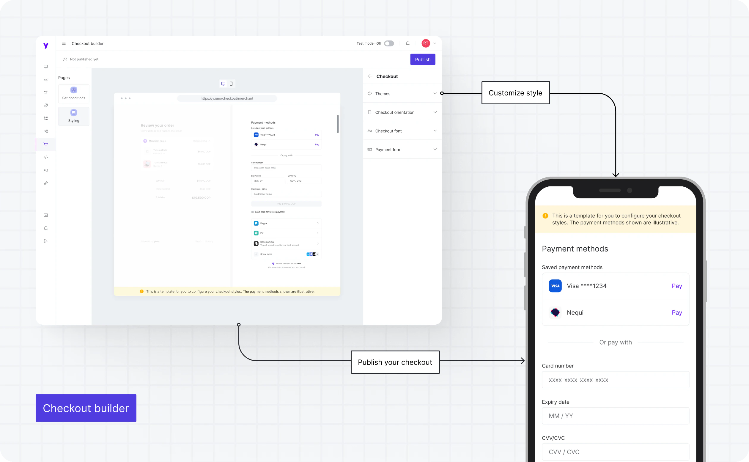
- Checkout styling: Adjust the checkout’s visual elements for desktop and mobile devices, including colors and typography. This ensures the checkout experience is consistent with your brand.
Advantages of using Checkout Builder
- Customization with no code: Enjoy the flexibility of tailoring your checkout experience without the need for complex coding. This empowers you to create a checkout process that aligns seamlessly with your brand and business objectives.
- Payment method flexibility: Easily enable, organize, and display the payment methods that best suit your customer base and market.
- Intuitive user interface: Yuno’s interface makes it a breeze to configure payment methods, set display conditions, and customize styling.
Payment method settings
This module lets you configure and customize the payment methods used in the checkout experience. Beyond activating payment methods, you can adjust the order in which they’re displayed, customize their appearance, set required fields, and determine conditions for when each payment method is displayed. This breadth of customization ensures the checkout experience fits your audience and specific use case. You must click Publish settings on the Checkout Builder to apply all changes to the checkout.Conditions
You can control when a payment method appears at checkout by setting display conditions based on criteria such as the order’s country, amount, currency, or integration metadata. To configure these settings:1
Initiate conditions
Next to the payment method, click the three dots icon and select Set Conditions. Click Add new condition in the pop-up.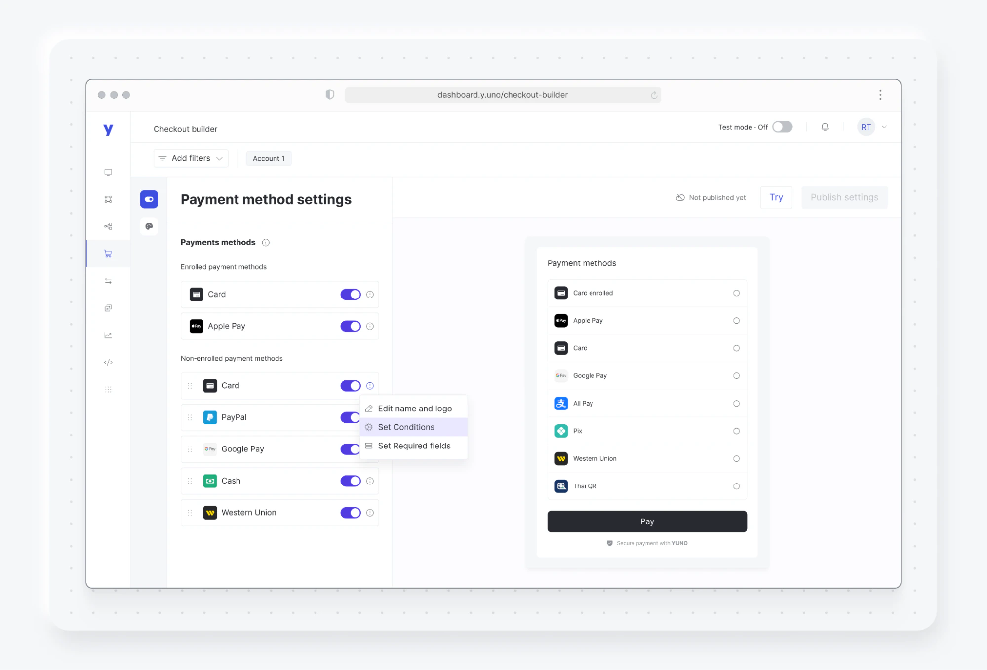
2
Define specifications
Enter a descriptive name and select parameters like order country, currency, or metadata.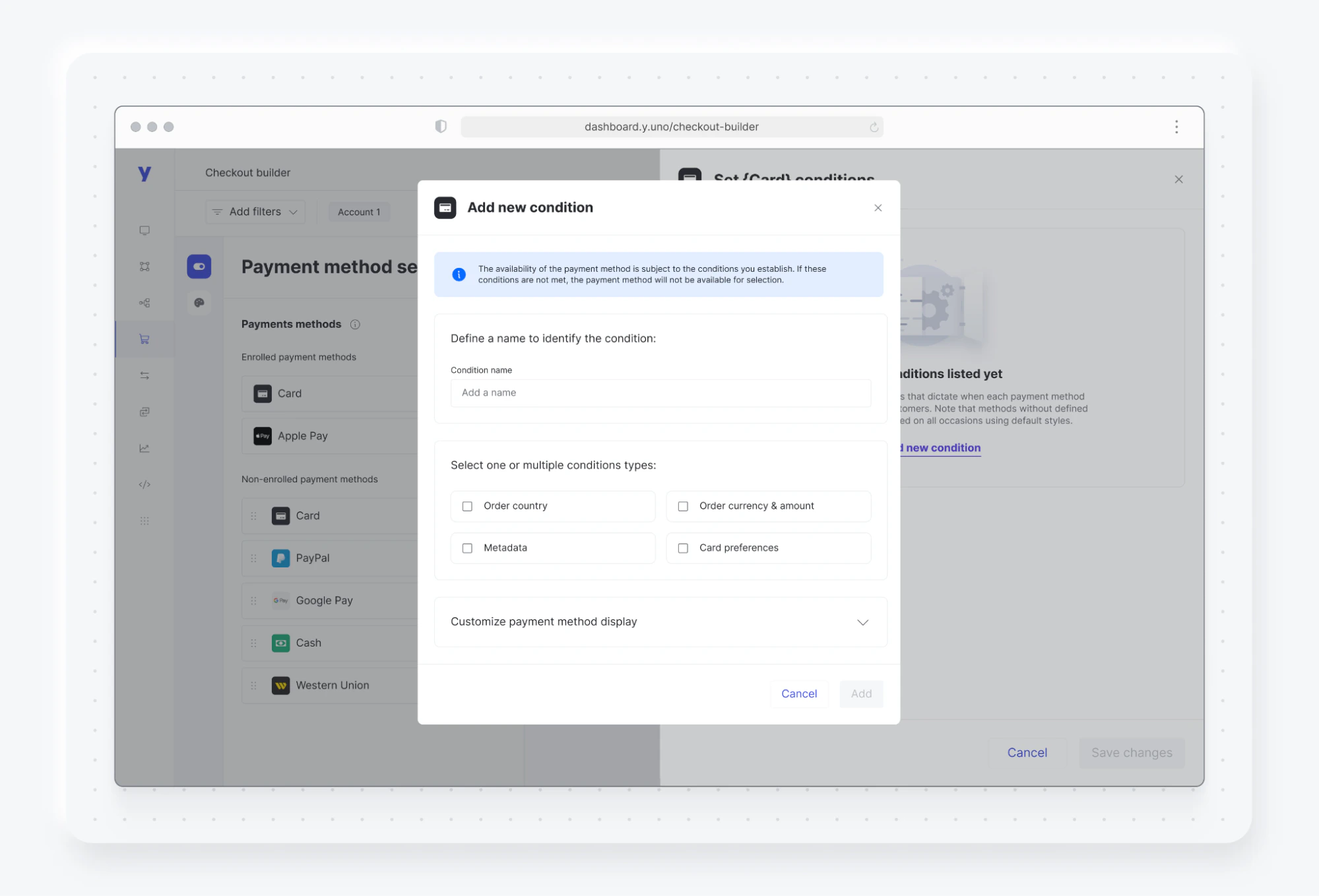
3
Complete configuration
Fill out the fields that appear based on your selected specifications.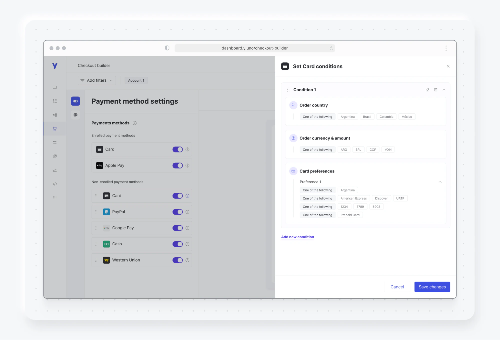
Required fields
Required fields specify the information users must provide when using each payment method. Some payment methods require specific data to process payments, and Yuno may request it even if you didn’t specify it. Yuno streamlines the process of adding or removing desired fields through its user interface. The Required Fields panel in the Checkout Builder lets you collect billing and shipping addresses as two independent forms during checkout. Billing address is used for card verification (AVS) and integrations with providers such as Stripe and Adyen, while shipping address is used for physical delivery.SDK version requirement: This feature is only available in Web SDK v1.7 or later. Merchants on earlier SDK versions will not see the new address forms even if the configuration is enabled in the Checkout Builder.
Where to find it
- Open the Checkout Builder in the Yuno Dashboard.
- In Payment method settings, click the three dots (⋯) on the payment method you want to configure and select Set Required fields.
- Find the Address configuration section in the Required Fields drawer.
This setting is per payment method, not global. Repeat the configuration for every payment method that should collect addresses.
How to configure
- In the Address configuration section, turn the toggle on.
- Choose the address mode:
- Billing Address only
- Billing & Shipping Address
- Click Save changes.
- Return to the Checkout Builder and click Publish settings for the changes to take effect in the live checkout.
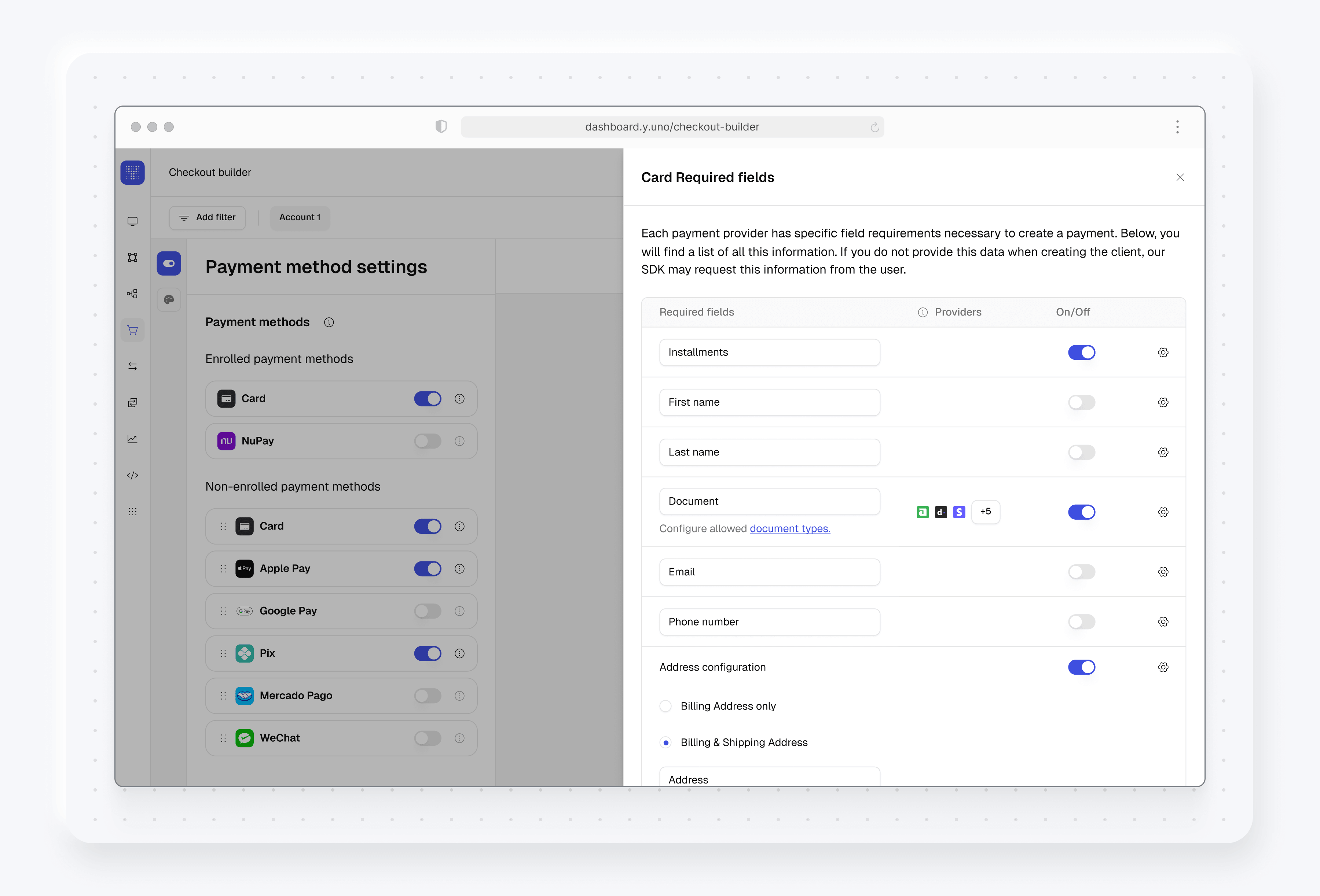
Available configuration
The “Billing address is the same as shipping address” checkbox is purely a Web SDK UX element. It is not configurable from the Checkout Builder — it appears automatically whenever both billing and shipping are enabled.
Important notes
- Backward compatibility: Existing checkouts that only had
billing_addressenabled continue to work exactly as before — the previous address fields are mapped to the billing address. No action is required for merchants who don’t want shipping collection. - Standalone Postal Code: The postal code field can be used standalone (without other address fields) for all providers and all SDK flows. When postal code is enabled and other address fields are disabled, the backend allows null values for all address fields except postal code. If both postal code and address fields are enabled in the Checkout Builder, the backend prioritizes address fields over postal code.
- Configure during low-traffic periods: Publishing changes to required fields affects all subsequent checkout sessions immediately. Customers in the middle of an in-flight session may see inconsistent forms during the propagation window. We recommend configuring and publishing this setting during low-traffic periods to minimize impact.
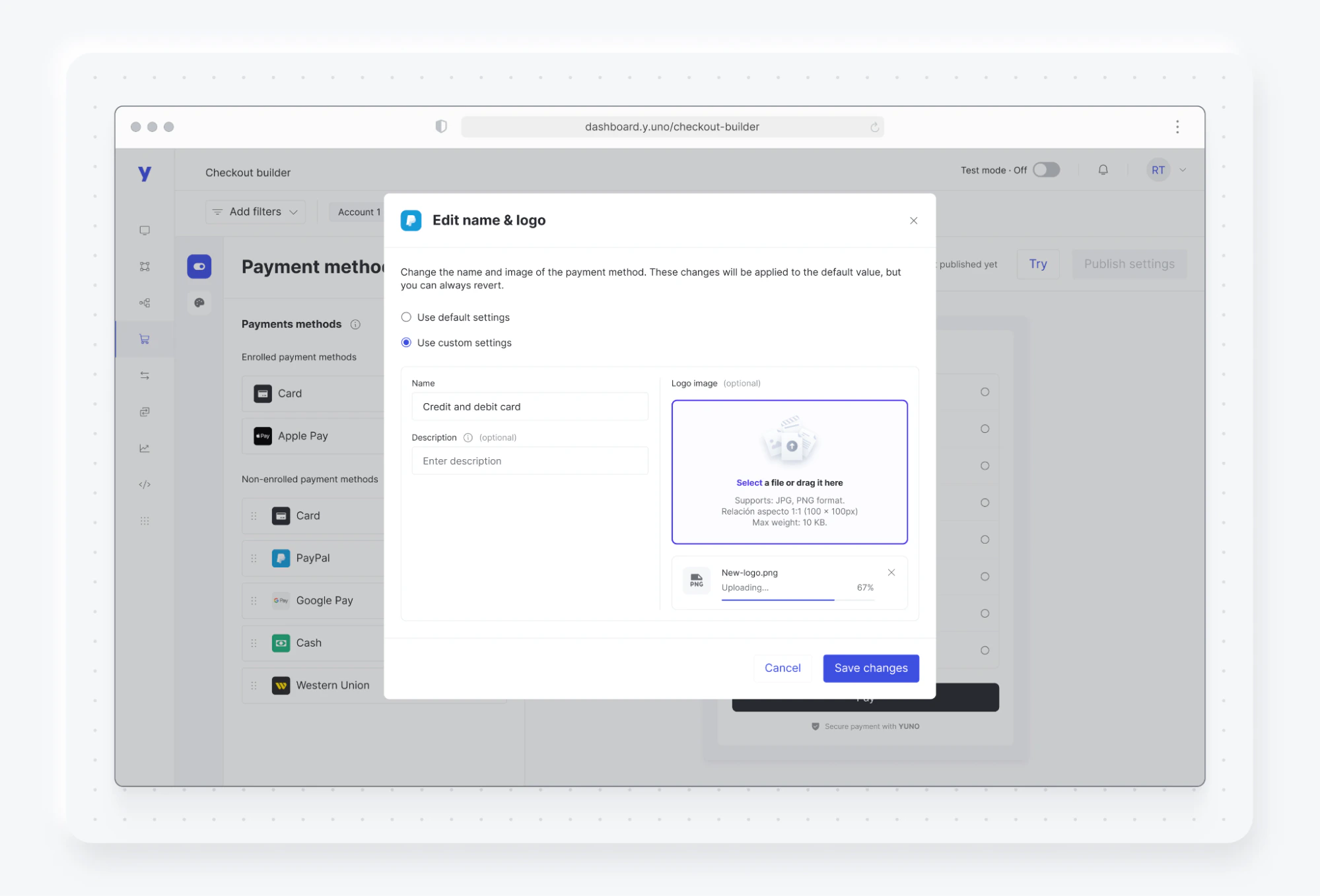
Edit name and logo
The name and logo settings control how a payment methods appear during checkout. This option is unavailable for enrolled payment methods. To adjust these settings:- Within Payment method settings, click the three dots icon next to any non-enrolled payment method and select Edit name and logo.
- Select Use custom settings to make changes.
- Enter your preferred name for the payment method.
- Optionally, you can add a description and provide a new logo URL. The URL must start with “https://”. Use a square image (JPG or PNG), 100x100 pixels in size, and up tp 10 KB.
- Click Save changes, followed by Publish settings to apply all changes.
Checkout styling
Match your brand’s unique look and feel using the Checkout Styling module. Changes made in this module are reflected in the end-user checkout immediately after publishing.General Styling Options
The General Styling section allows you to adjust key visual elements, creating a consistent and professional look throughout the checkout experience. In this section, you can customize the following elements:Real-time checkout preview
The Checkout Builder includes a live preview panel on the right side of the screen. The preview reflects your current configuration as you make changes — without requiring you to publish first. The preview is available in both the Payment method settings and Styling settings tabs.What the preview shows
- The payment methods currently enabled and their display order
- Express payment buttons (PayPal, Apple Pay, Google Pay) when active
- The card form with all configured required fields
- Color, typography, and styling changes as you adjust them
Interactive fields
You can interact with the form fields directly in the preview panel. This lets you test field validation and error messages — for example, entering an invalid CVV triggers the error copy in real time.The preview supports interactive field testing up to the Pay button. It does not simulate a complete end-to-end payment flow. To test a full transaction, use the SDK in a test environment.