Deprecated Design
Deprecation WarningThis design system is deprecated and will be removed in the future. Please use the Default Design for all new customizations.
The Deprecated Design is available for Yuno clients needing access to CSS class information. However, this option will be removed in the future.
Use the following links to navigate to the desired component:
Input
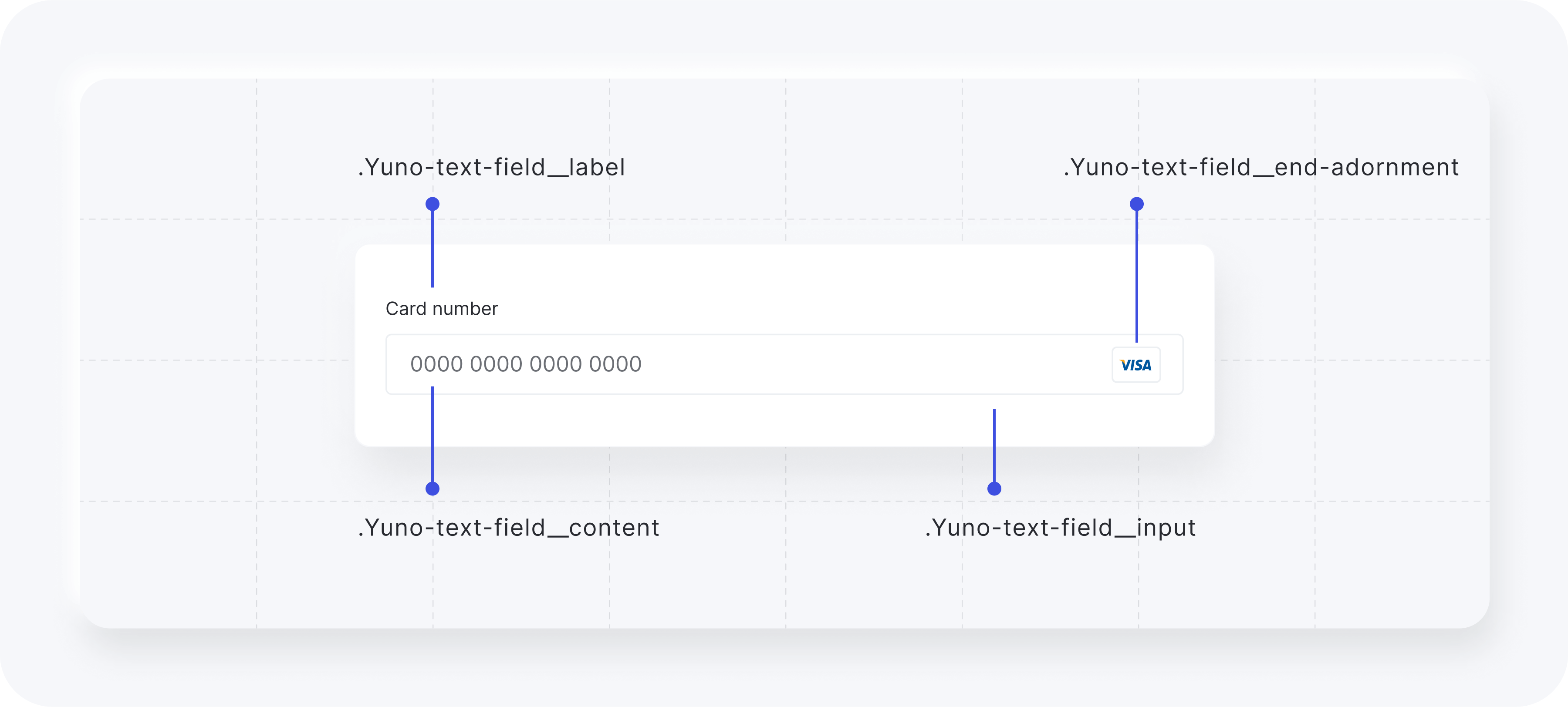
The classes available for customizing the input element while using the Deprecated Design are listed in the following table.
| CSS Class | Description |
|---|---|
.Yuno-text-field__content | General container for text fields. |
.Yuno-text-field__label | Label for text fields. |
.Yuno-text-field__input | Input area for text fields. |
.Yuno-text-field__end-adornment | End adornment for text fields. |
The images below show how each class will affect the input element.
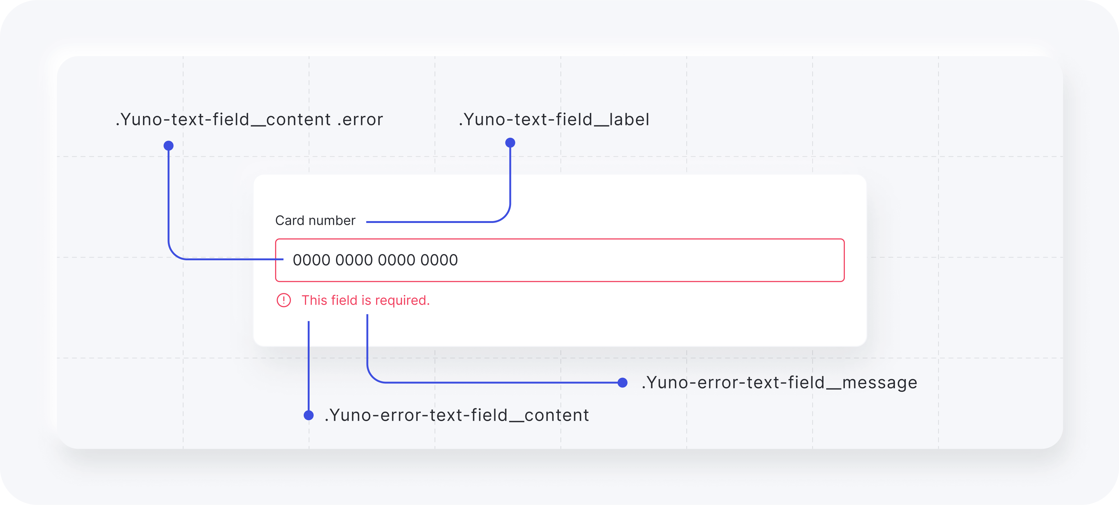
Error warning classes:
| CSS Class | Description |
|---|---|
.Yuno-error-text-field__content | Container for error message content. |
.Yuno-text-field__label | Label for text fields. |
.Yuno-text-field__content .error | Container for the input in case of an error. |
.Yuno-error-text-field__message | Text for error messages. |
The images below show how each class will affect the input element.
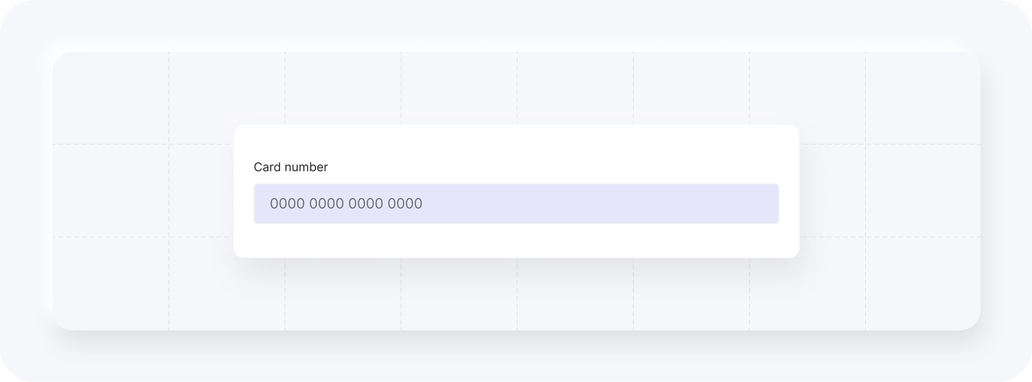
Example (input). Add to card when calling yuno.startCheckout:
styles: `
  #root {
    // content
    .Yuno-text-field__content {
      // label
      .Yuno-text-field__label {
        color: white;
      }
      // input
      .Yuno-text-field__input {
        background: lavender;
        border-color: #35363E;
      }
      // input focus
      .Yuno-text-field__input:focus {
        border: '2px solid #35363E';
      }
    }
  }
`,
Result:
Dropdown
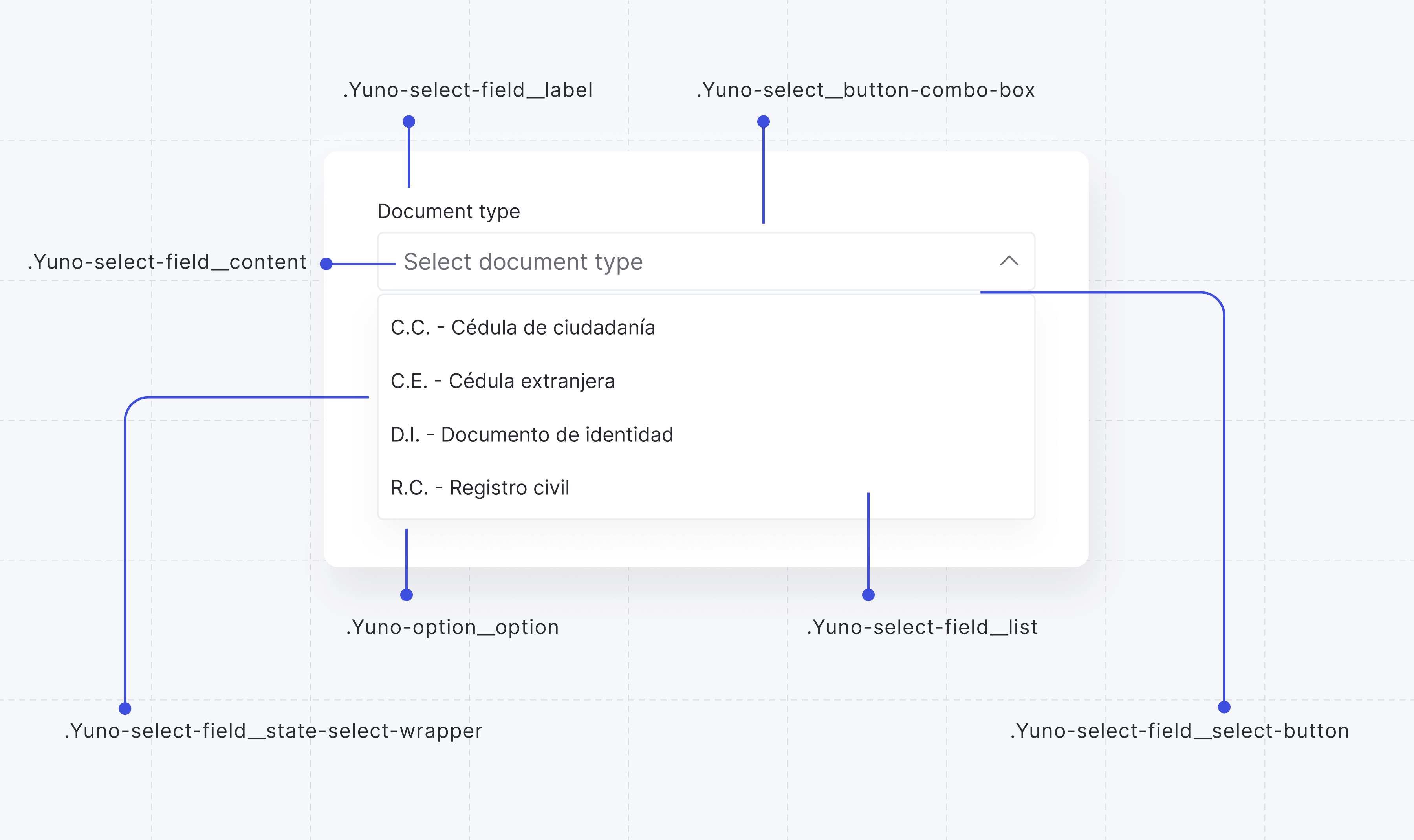
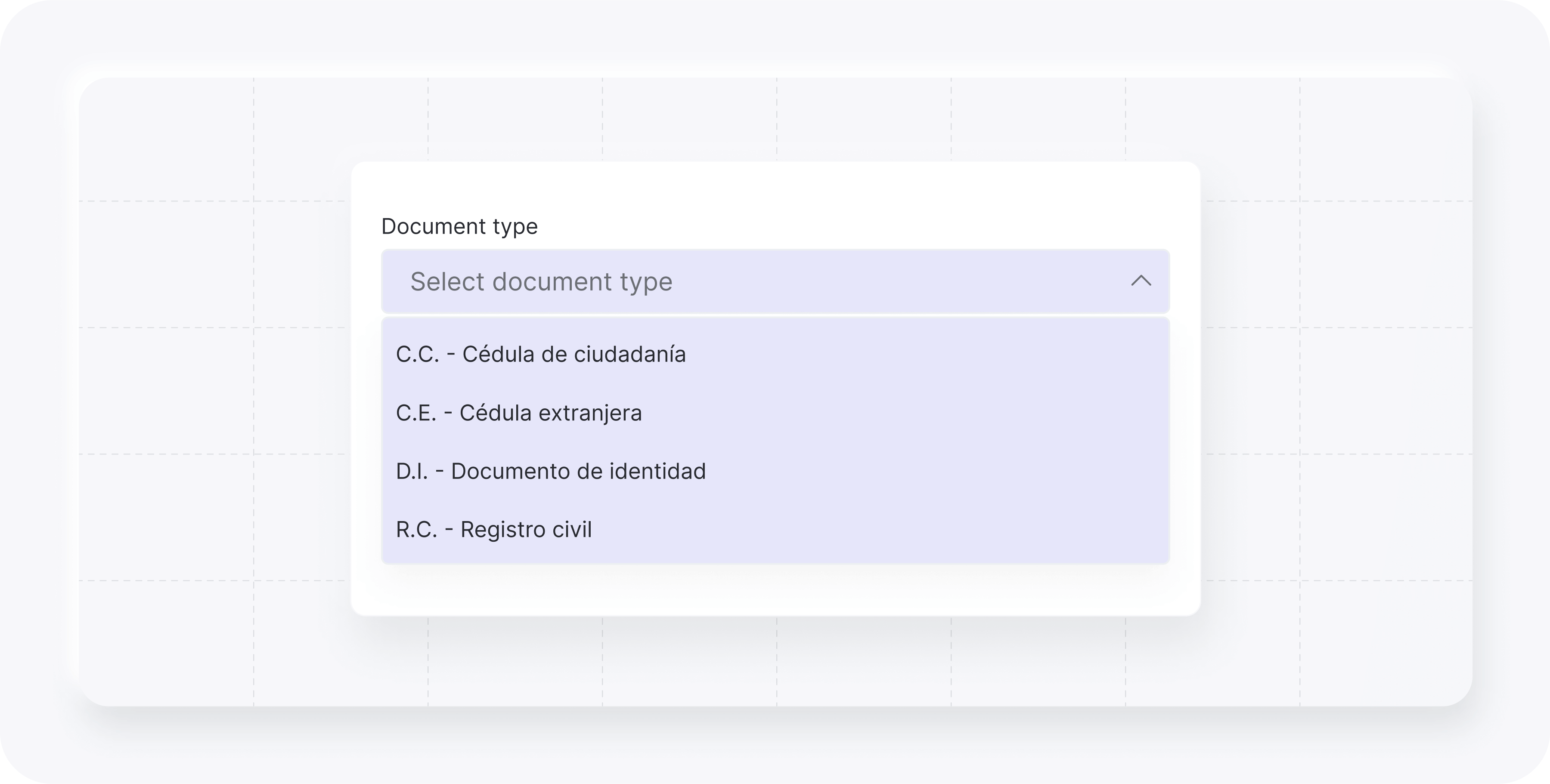
The classes available for customizing the dropdown element while using the Deprecated Design are listed in the following table.
| CSS Class | Description |
|---|---|
.Yuno-select-field__state-select-wrapper | Wrapper for state select field. |
.Yuno-select__button-combo-box | Button for combo box elements. |
.Yuno-select-field__content | Content area for select field. |
.Yuno-select-field__label | Label for select field. |
.Yuno-select-field__select-button | Select button for the field. |
.Yuno-select-field__list | List container for select options. |
.Yuno-option__option | Individual option in select list. |
The images below show how each class will affect the dropdown element.
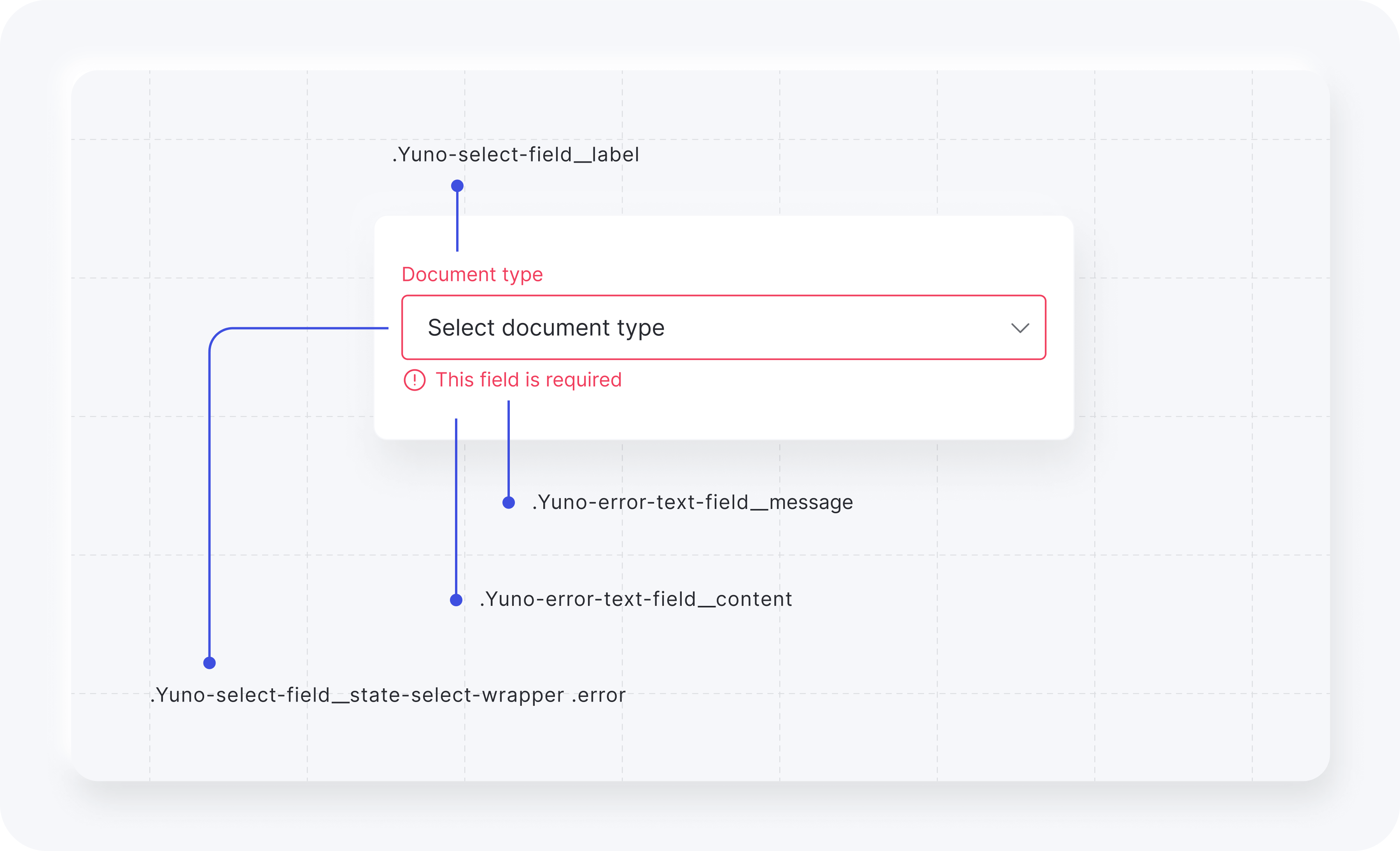
Error warning classes:
| CSS Class | Description |
|---|---|
.Yuno-select-field__state-select-wrapper .error | Wrapper for state select field with error styling. |
.Yuno-error-text-field__content | Container for error message content. |
.Yuno-select-field__label | Label for select field. |
.Yuno-error-text-field__message | Text for error messages. |
The images below show how each class will affect the dropdown element.
Example (dropdown). Add to card when calling yuno.startCheckout.
styles: `
  #root {
    //dropdown
    .Yuno-select-field__content {
      .Yuno-select-field__label {
        color: white;
      }
      .Yuno-select-field__select-button {
        background: lavender;
        border-color: #35363E;
      }
      .Yuno-select-field__list {
        background: lavender;
        border-color: #35363E;
      }
    }
  }
`,
Result:
Button
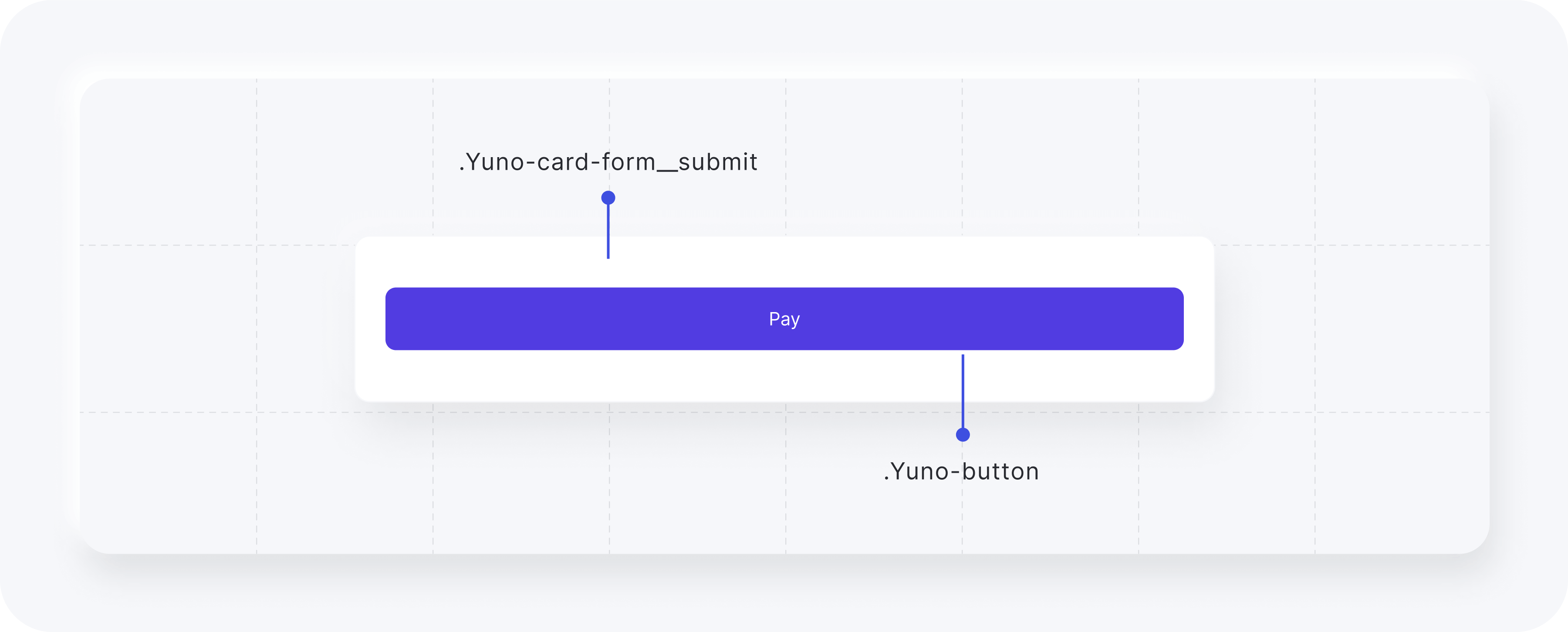
The classes available for customizing the button element while using the Deprecated Design are listed in the following table.
| CSS Class | Description |
|---|---|
.Yuno-card-form__submit | Class to configure the button container. |
.Yuno-button | Class to configure the pay button. |
The image below presents how each class will affect the button element.
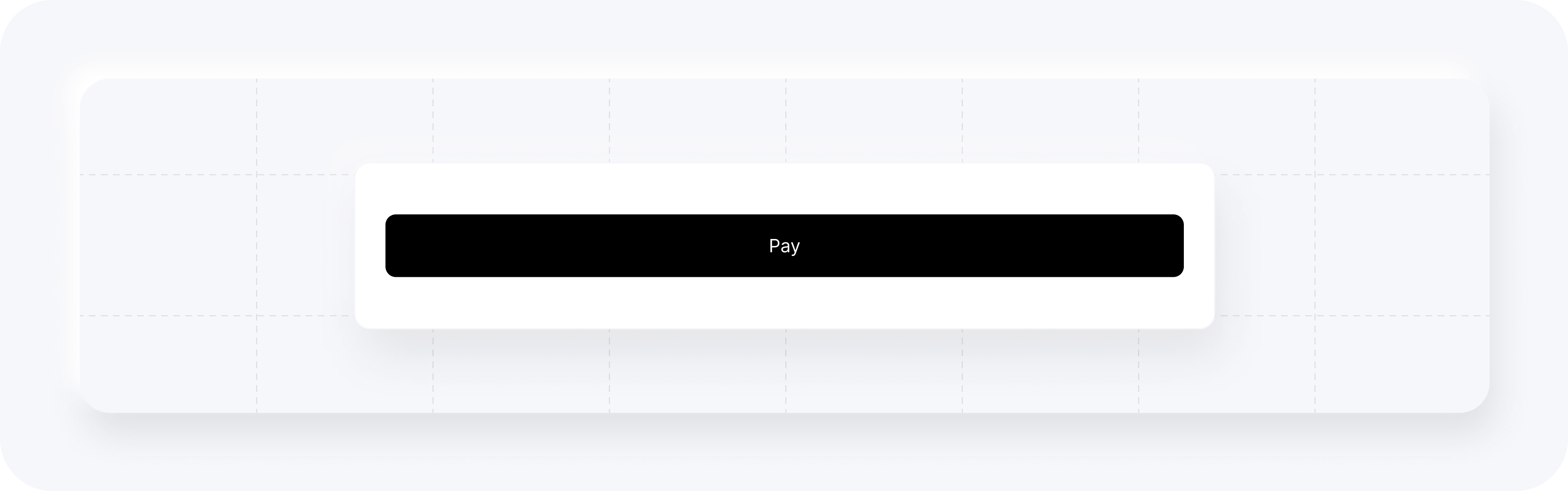
Example (button). Add to card when calling yuno.startCheckout.
styles: `
  #root {
    .Yuno-button {
      background: rgb(40, 42, 48);
    }
  }
`,
Result:
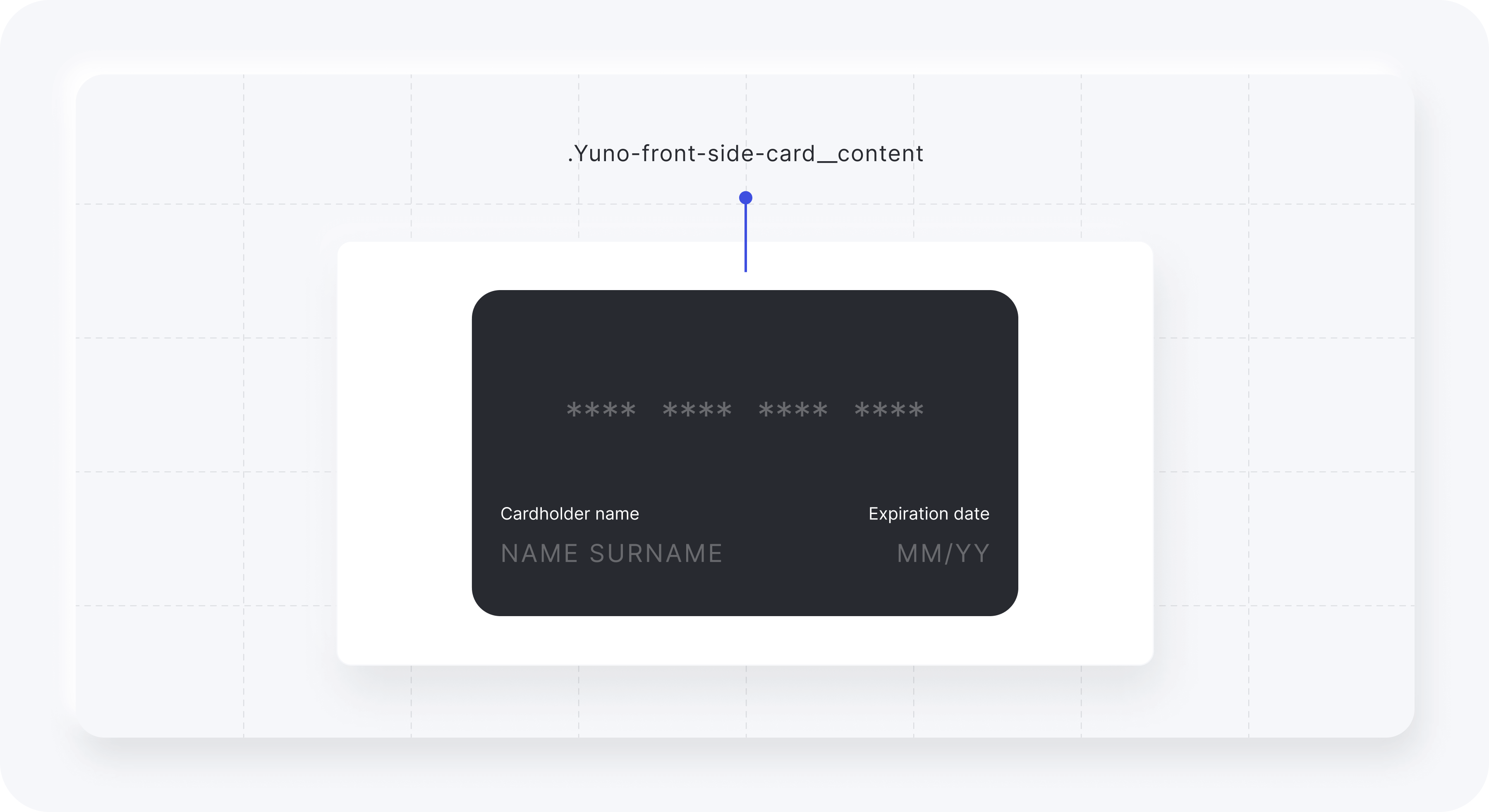
Card
The classes available for customizing the card element while using the Deprecated Design are listed in the following table.
| CSS Class | Description |
|---|---|
.Yuno-front-side-card__content | Class to configure the card element content. |
The image below presents how each class will affect the card element.
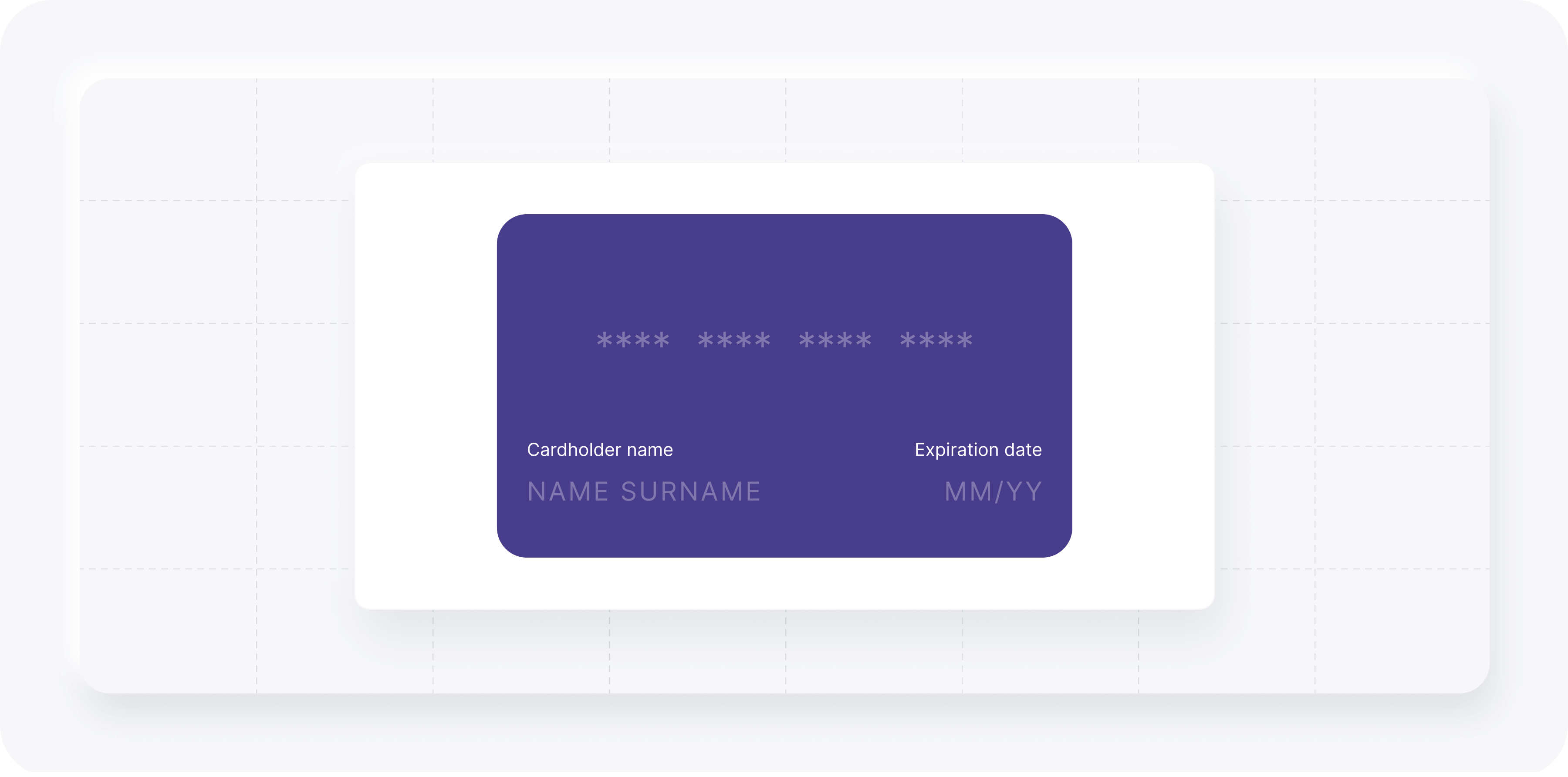
Example (card). Add to card when calling yuno.startCheckout.
styles: `
  #root {
    .Yuno-front-side-card__content {
      background: darkslateblue;
    }
  }
`,
Result:
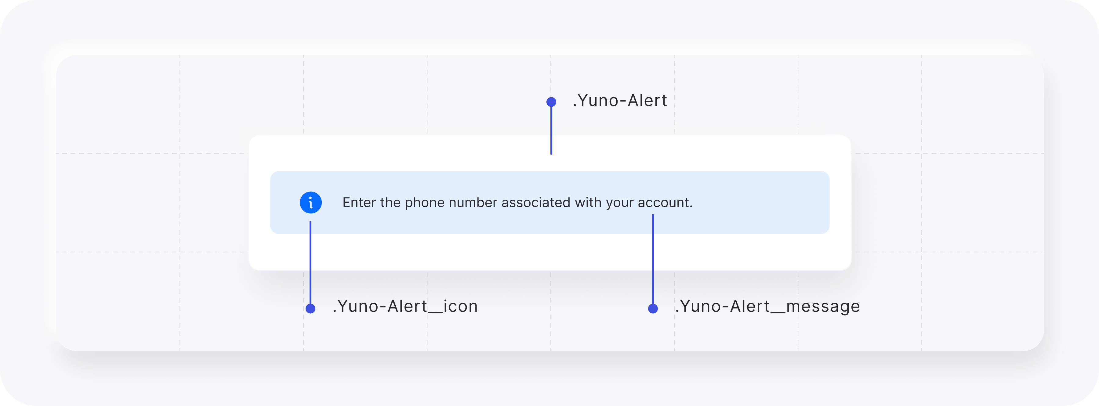
Alert
The classes available for customizing the alert element while using the Deprecated Design are listed in the following table.
| CSS Class | Description |
|---|---|
.Yuno-Alert | Configure the alert container. |
.Yuno-Alert__icon | Enables you to change the alert icon. |
.Yuno-Alert__message | Text for the alert element. |
The image below presents how each class will affect the alert element.
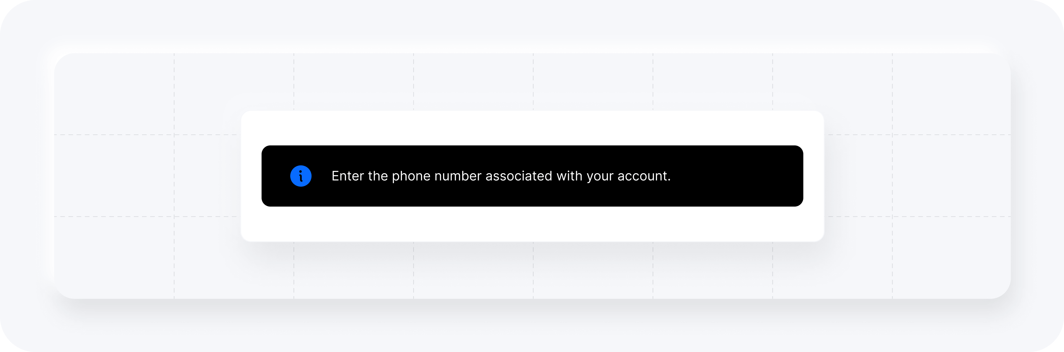
Example (alert). Add to card when calling yuno.startCheckout.
styles: `
  .yuno-modal-user-form {
    .Yuno-Alert {
      background-color: black;
      .Yuno-Alert__message {
        color: white;
      }
    }
  }
`,
Result:
Modal
The modal element provides two options you can customize:
- Form Card Modal
- APM Modal
Modal customization requirements
Define the modal custom style directly in your web page.
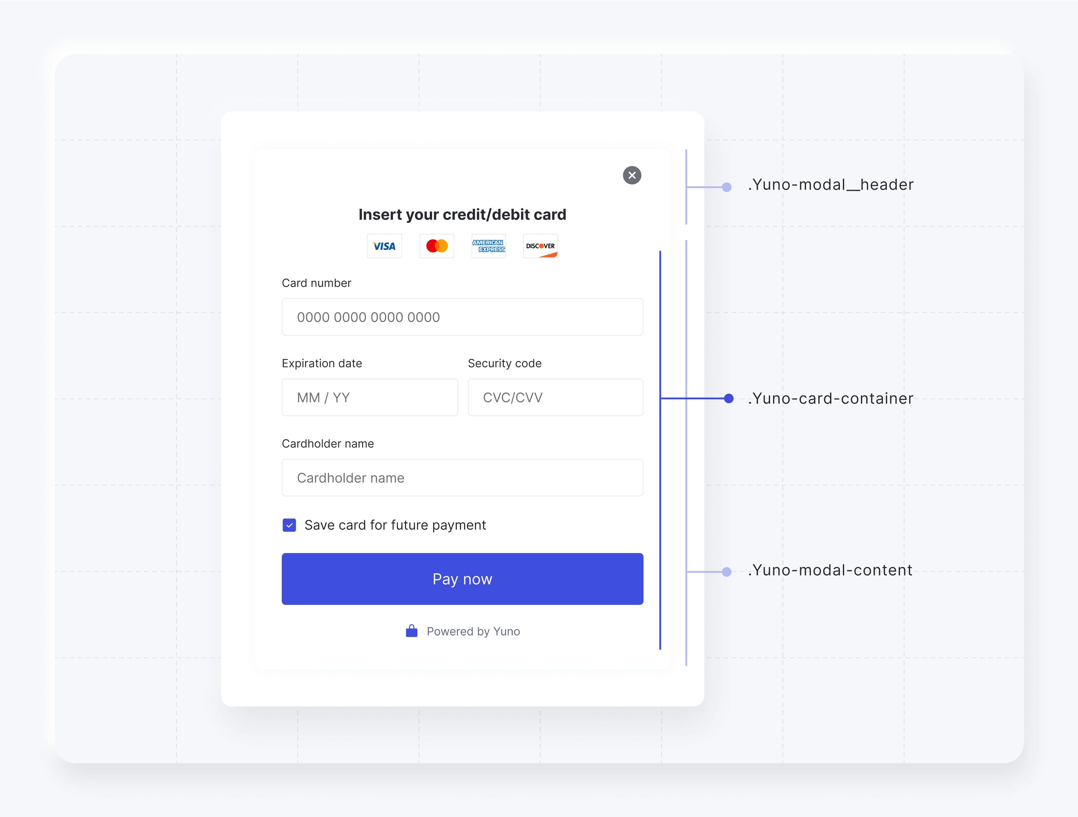
Form Card Modal
Within the Form Card Modal, three iframes exist, where the card number input, expiration input, and CVV input are rendered separated. The name of the card owner is a standard input.
The classes available for customizing the form card modal element while using the Deprecated Design are listed in the following table.
| CSS Class | Description |
|---|---|
.yuno-modal__content | Design the modal content. |
.yuno-modal__header | Define the modal header style. |
.Yuno-card-container | Configure the modal container. |
The image below presents how each class will affect the form card modal element.
The code block below presents an example of how you can customize the form card modal element.
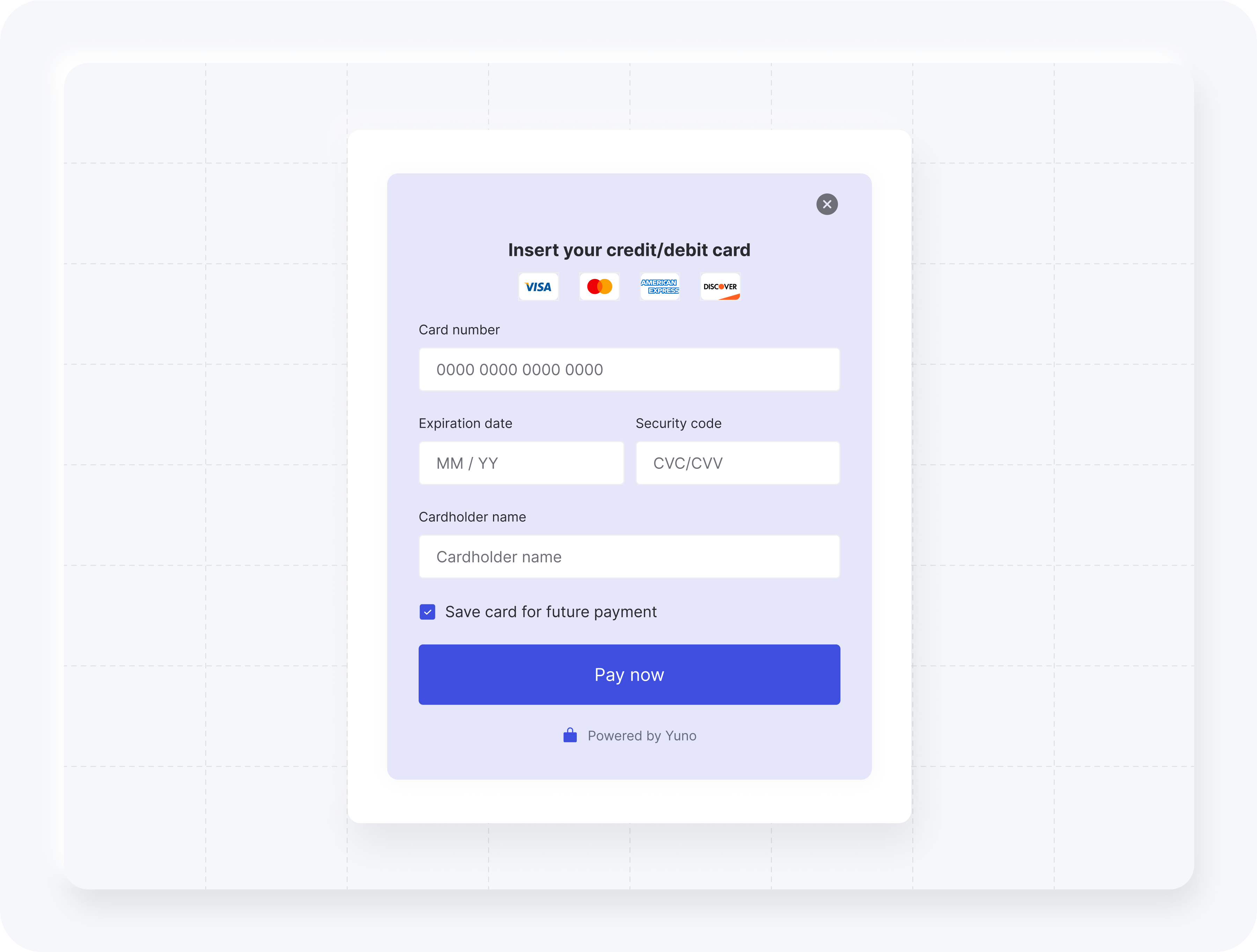
styles: `
  .yuno-modal__content {
    background: lavender !important;
  }
`,
Result:
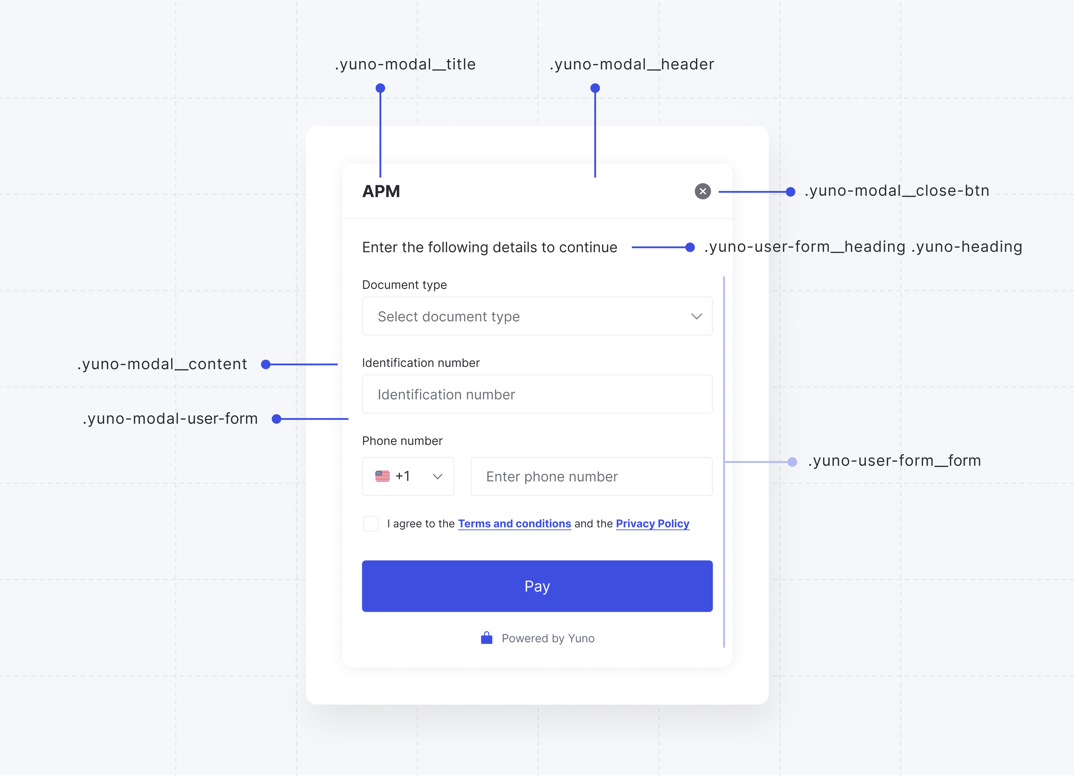
APM Modal
The classes available for customizing the APM modal element while using the Deprecated Design are listed in the following table.
| CSS Class | Description |
|---|---|
.yuno-modal__content | Container for modal content. |
.yuno-modal__header | Header section of the modal. |
.yuno-modal__title | Title of the modal. |
.yuno-modal__close-btn | Close button for the modal. |
.yuno-modal-user-form | User form within the modal. |
.yuno-user-form__heading .yuno-heading | Heading for the user form. |
.yuno-user-form__form | Form container within the user form. |
The image below presents how each class will affect the APM modal element.
The code block below presents an example of how you can customize the APM modal element.
styles: `
  .yuno-modal__content {
    background: rgb(40, 42, 48) !important;
  }

  .Yuno-select-field__content {
    .Yuno-select-field__label {
      color: white;
    }
  }

  .yuno-modal__content {
    .yuno-modal__header {
      .yuno-modal__title {
        color: white;
      }
    }
  }

  .yuno-modal-user-form {
    .yuno-user-form__heading.yuno-heading {
      color: white;
    }
  }

  .Yuno-text-field__content {
    .Yuno-text-field__label {
      color: white;
    }
  }

  .yuno-grid-phone label {
    color: white;
  }

  .yuno-user-form__form .yuno-terms-conditions {
    color: white;
  }
`,
Result:

Updated about 1 month ago